
Mit Saxophone
Make It True — a brand identity system for Taiwan's leading saxophone institution.
Client:
Mit Saxophone
Year:
2023
Industry:
Arts & Culture
Duration:
8 Weeks
Services:
Brand Identity
Packging
Overview:
Mit Saxophone is one of Taiwan's most established names in the saxophone world, operating across three distinct domains: ensemble performance, music education, and a specialist retail store. Each pillar has its own audience and context, yet all three needed to speak as a single, coherent brand. The design challenge was systemic from the start — not just to create a logo, but to build a visual identity architecture that could hold three different services together without flattening what made each one distinct. The brand's English name, MIT, became the conceptual engine of the project. As an acronym, it gave rise to the brand spirit line: Make It True — a statement about the belief that drives every student, every performer, and every instrument sold under the Mit name. Dreams realized, not deferred.

Challenges:
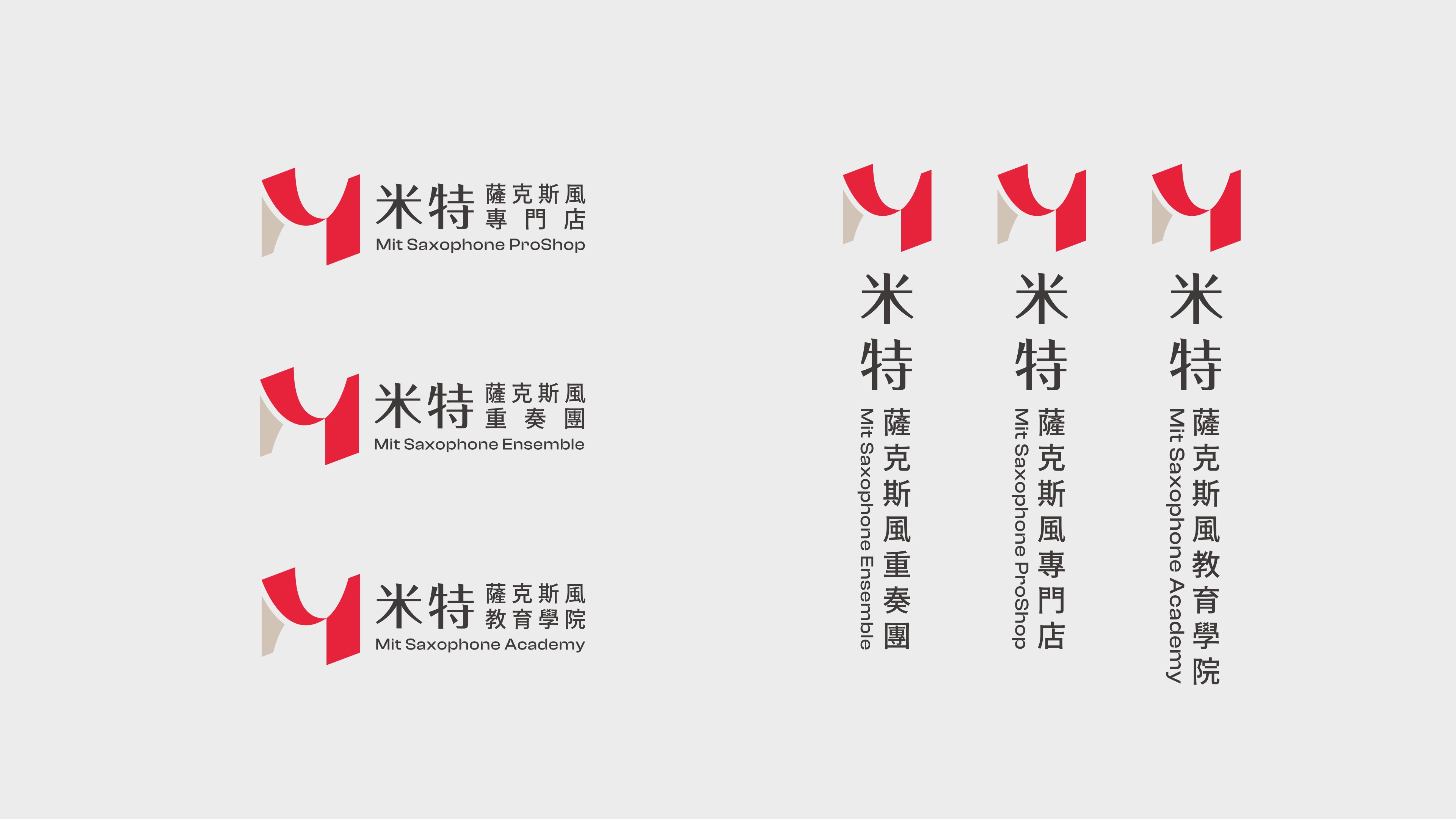
Designing a brand system for an organization with three service areas requires a clear hierarchy — one that allows sub-brands and service-specific applications to exist without fragmenting the parent identity. The solution was a tiered visual system: a primary mark for the Mit brand as a whole, with horizontal and vertical lockup configurations built for different contexts. In everyday communication where the brand speaks as one, Mit stands alone. Where a specific service area needs to identify itself, the system extends — consistently, and always within the same visual logic.







Conclusion:
The logomark brings together three ideas in a single form: the silhouette language of the saxophone, the brand's initial M, and a sense of spatial openness — a stage, a room, a place where something can happen. The depth built into the mark is intentional. Mit has always positioned itself as a destination for aspiration, not just instruction, and the logo reflects that sense of possibility in its form. Red anchors the color system as the primary tone — bold, fearless, and warm enough to carry the passion that saxophone music demands. Alongside it, a light tan drawn directly from the instrument's brass body grounds the palette in something tactile and timeless. Together, the two colors hold the tension at the heart of the brand: fire and permanence, ambition and craft.

