
Zytca
Rebuilding clarity for an animal biotech brand rooted in precision science and symbiotic thinking.
Client:
Zytca
Year:
2025
Industry:
Health & Technology
Duration:
5 Weeks
Services:
Brand Identity
Overview:
ZYTCA is an animal biotech company from Oxford, specializing in qPCR molecular diagnostics. Before the rebrand, their visual identity carried two fundamental issues: the brandmark and wordmark lacked a coherent visual logic, creating confusion in how the brand was read and remembered. Meanwhile, the Oxford Blue they had adopted — a nod to their academic roots — worked against them in practice. In an industry where brands compete through distinct, energetic visual languages, the palette felt constrained and difficult to extend. The project began with a clear objective: preserve the team's intellectual credibility while building a visual system flexible and vibrant enough to hold its own in the field.

Challenges:
Finding the right color direction required more than a palette swap. Through a series of online interviews, brand questionnaires, and moodboard workshops with the ZYTCA team, we worked to define what "professional vitality" actually looked like for them. The challenge was not to abandon restraint, but to expand it — introducing a supporting color system that could signal scientific precision while still carrying the energy the industry demands. Equally important was restructuring the relationship between brandmark and wordmark so that each element could function independently without losing coherence as a system.






Conclusion:
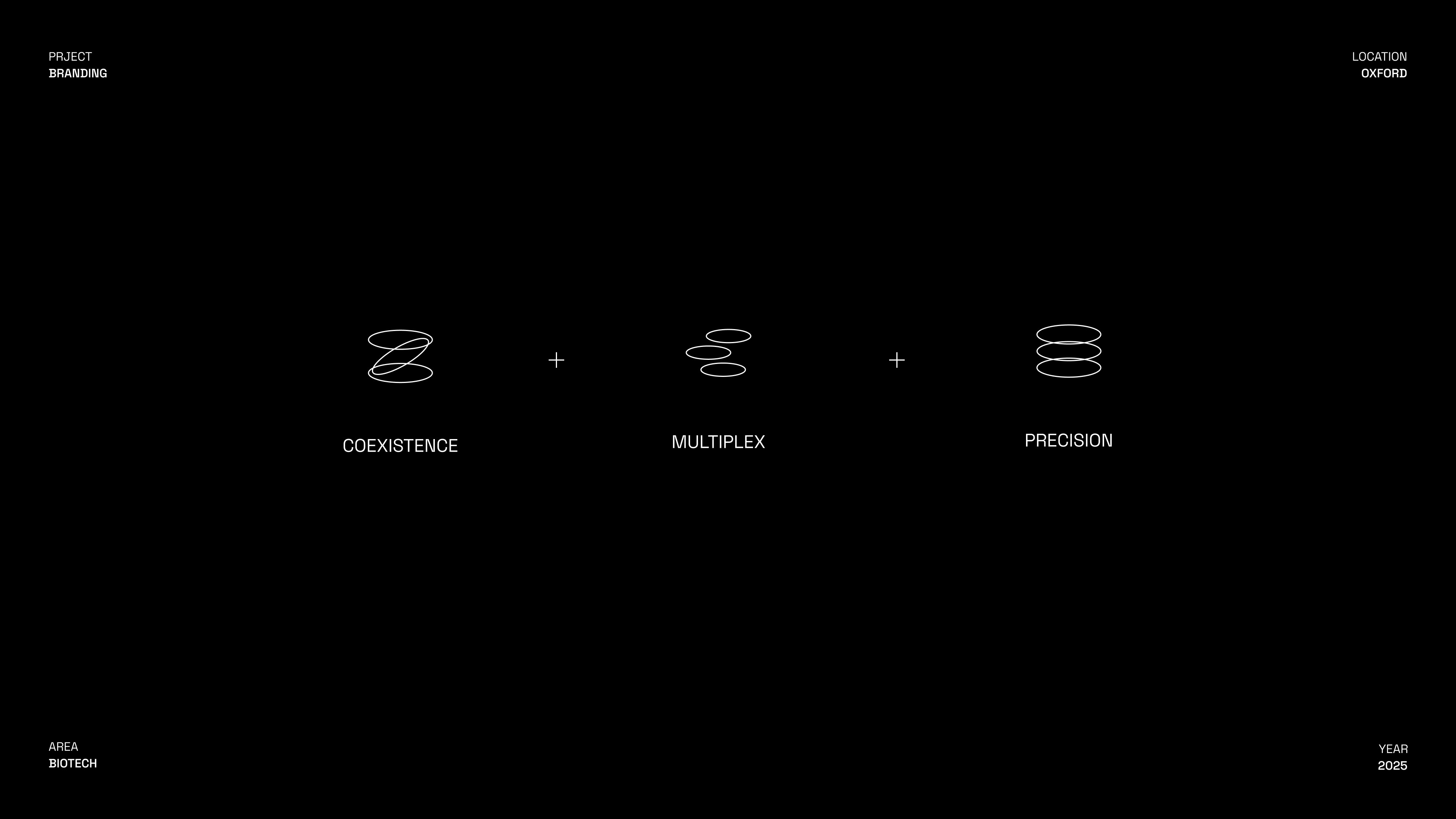
The new ZYTCA identity centers on a redesigned Z mark — drawn from three converging ideas: the multiplex detection logic of qPCR technology, the symbiotic relationship between animal life and diagnostic science, and precision measurement as the brand's core promise. These principles were distilled into a geometric form that echoes the brand's initial, while embedding the scientific and biological thinking behind the work. The result is a brand identity that speaks fluently to both research partners and industry audiences — grounded in rigor, opened up by intention.
