
Treehaus Academy
A brand identity that gives every child permission to grow in their own color.
Client:
Treehaus Academy
Year:
2022
Industry:
Eduaction
Duration:
5 Weeks
Services:
Brand Identity
Overview:
Treehaus Academy is a preschool based in Yunlin, Taiwan, founded on the belief that early childhood is not a stage to accelerate — it is a space to explore, play, and begin discovering who you are. The name says it directly: Tree for growth and nature, Haus for home. Together, they describe a place where children are not shaped into something predetermined, but given roots and room to branch in their own direction. The brand tagline — Find Your True Color — became the conceptual spine of the entire project. It is an invitation extended equally to children and to parents: this is a place where individuality is not managed but celebrated.

Challenges:
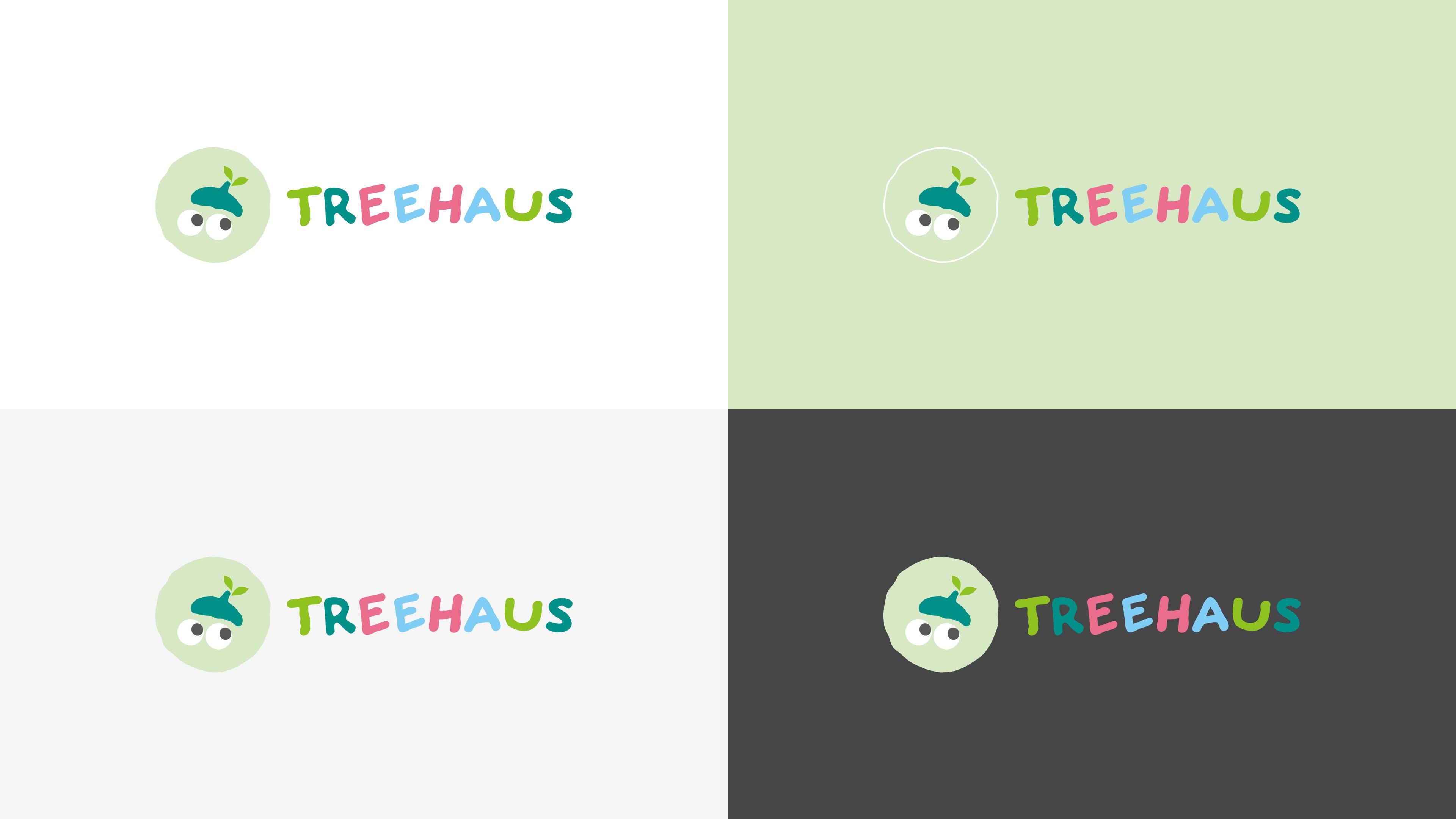
Designing for early childhood education means navigating a specific tension. The brand must feel warm and playful enough for children to connect with, while remaining trustworthy and considered enough for parents — who are ultimately the decision-makers — to take seriously. Too polished, and it reads as institutional. Too cartoonish, and it loses credibility. The logomark resolves this through character: a wide-eyed acorn figure — a forest sprite, mischievous and full of wonder — wearing a beret with a small sprout emerging from the top. It captures something true about young children: their curiosity is pure, their joy immediate, and their imagination lives closest to the natural world. The acorn is a seed before it becomes a tree, a child before they become themselves. The beret signals creativity and learning. The sprout signals potential already beginning to stir. It is a mark that speaks directly to children without talking past the parents standing beside them.


Conclusion:
The color palette takes the tagline literally. Rather than anchoring the brand to a single dominant tone, five distinct colors were developed — light mint, grass green, deep teal, sky blue, and warm pink. In the wordmark, these colors rotate across the letters so that no two share the same hue. The system resists uniformity by design — because no two children do either. A concentric ring motif runs through the supporting graphic system, drawn directly from the growth rings of a tree — echoing the brand name and deepening the visual world Treehaus inhabits. The rings expand outward the way a child's world does: slowly, steadily, with every new thing encountered. Together, the full identity does not simply identify a school — it communicates what kind of place it is to grow up in.

